Every new year is an opportunity for us to reflect on who we are and realign on who we want to be. Last year, we redefined our brand purpose – 'Design for Life’ became our new North Star and now guides everything we do. This year, our visual identity follows suit.
![]()
The first time we refreshed our brand logo was in 2018. Characterized by the sharp edges and the uppercase typeface, this logo was fitting for a time when we focused on creating high quality cables and chargers in an industry of cheap and plenty. We most definitely won’t stop creating these refined power solutions we know you love (and we do, too), but we’ve since broadened our innovations in a way that we felt our visual identity had yet to encapsulate.
As we continue to commit to ‘Design for Life’ and as such expand our product range in new directions, we wanted a softer typography to reflect this more holistic approach to creating for the modern lifestyle.
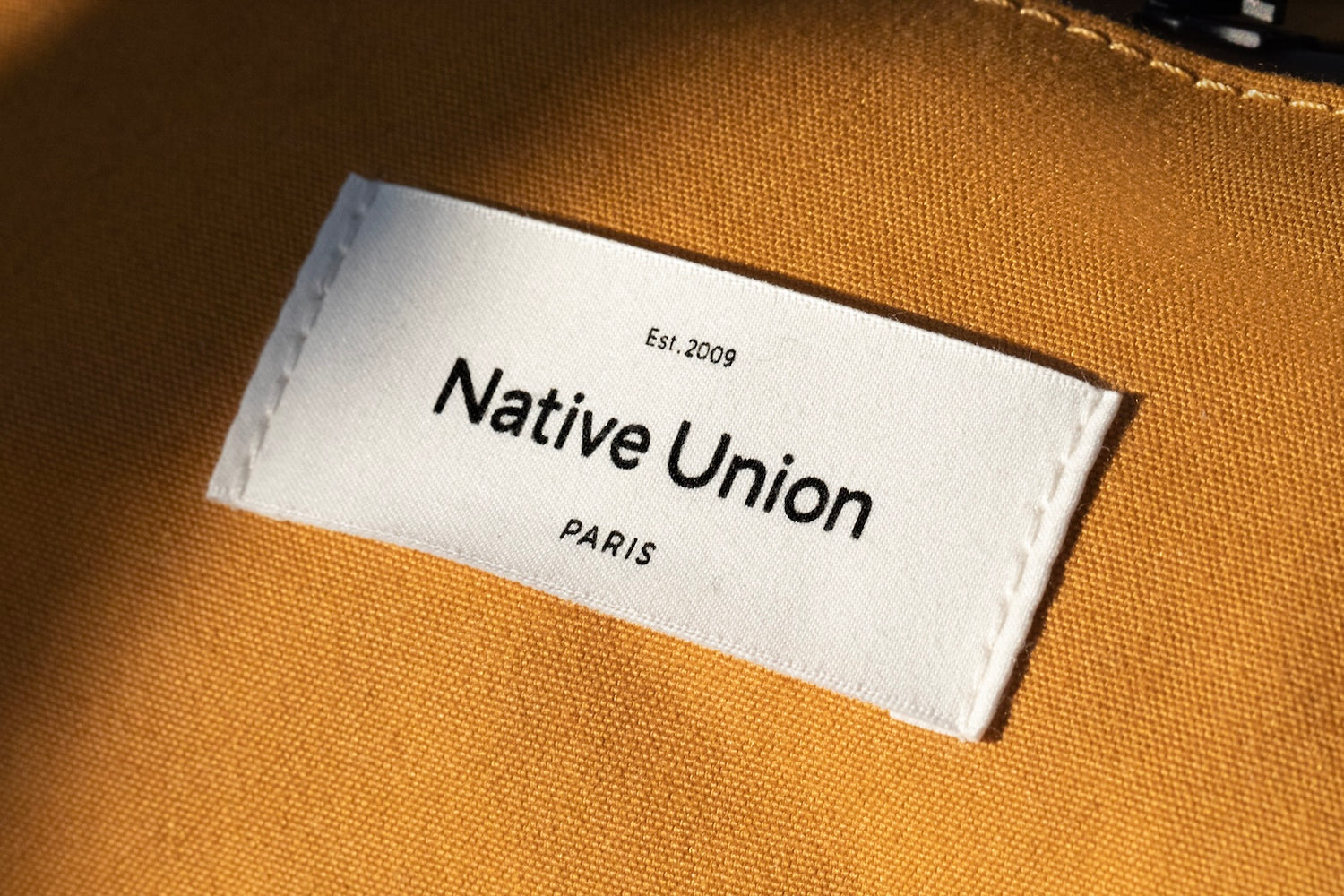
Our new logo remains minimalist in style but replaces the previous sharpness with a more rounded finish. Surrounding our brand name are nods to our roots, capturing who we are, where we came from, and where we want to go from here.

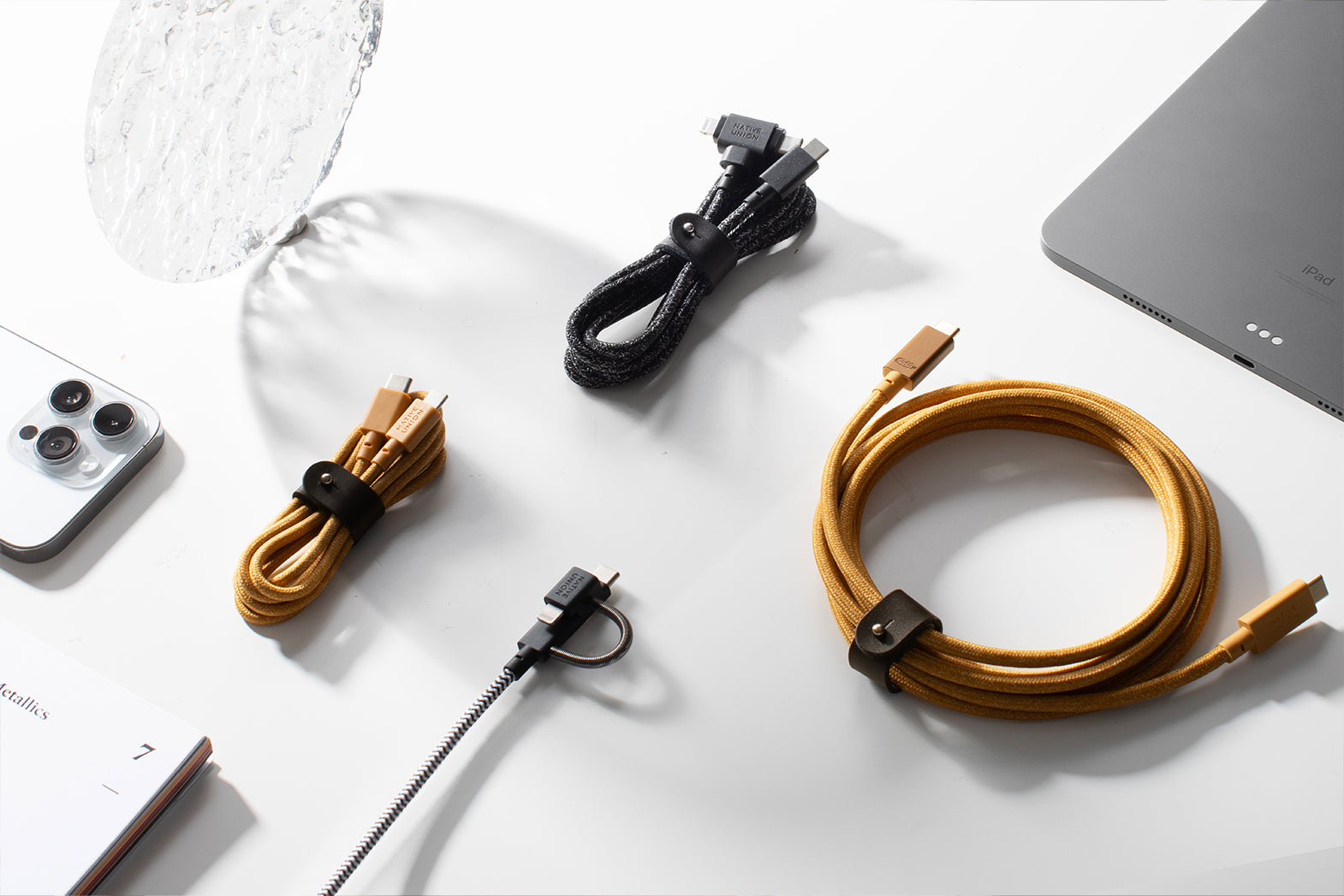
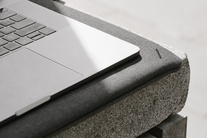
Since our inception, we’ve been evolving to maximize the way you use your tech. Be it Qi-charging, MagSafe, or the rise of USB-C, we've found clever ways to integrate the latest advancements more seamlessly into your day to day.
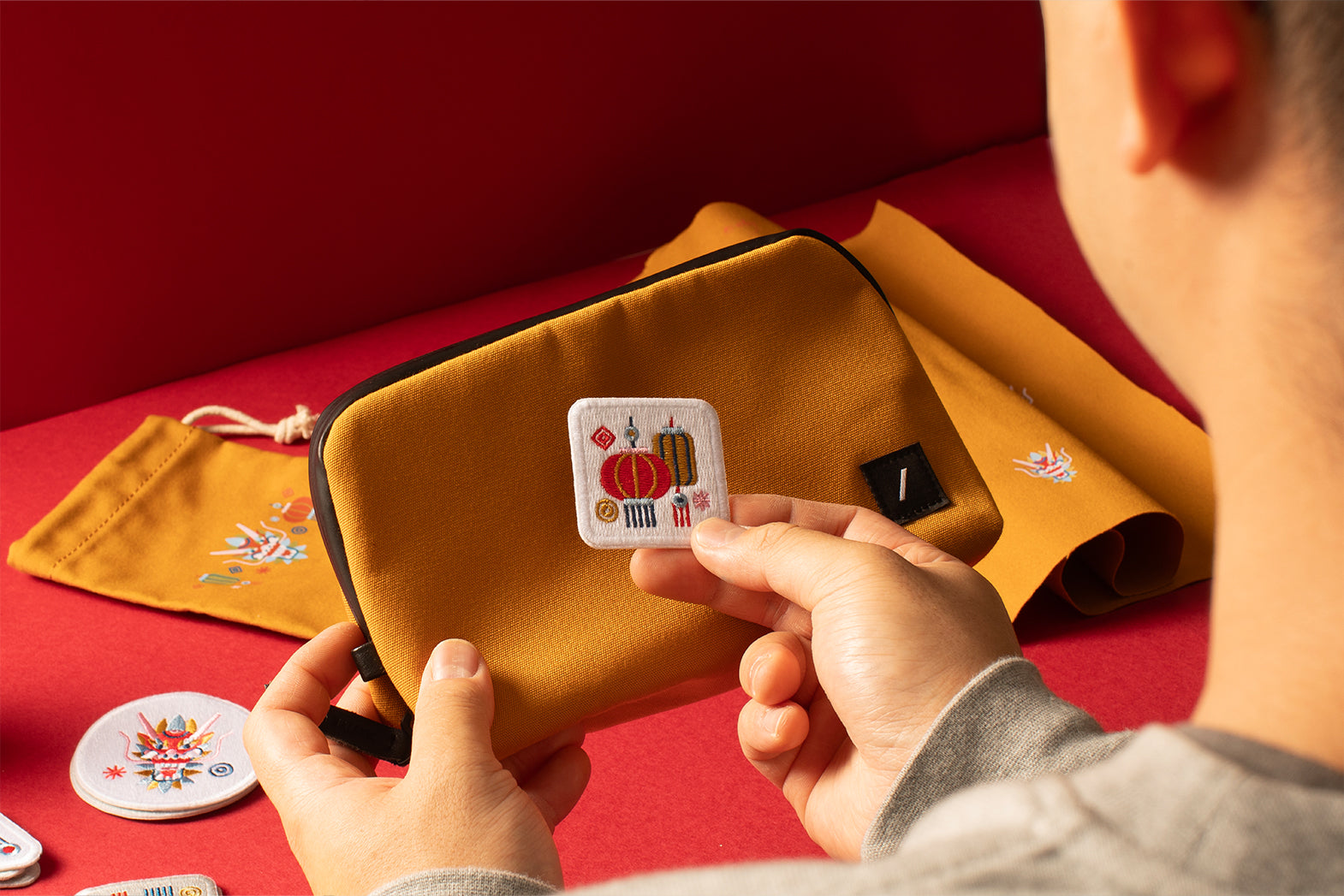
And by experimenting with materials from marble to wood to unique plant-based compounds, we’ve transformed your devices from purely functional to something you’re proud to carry or have adorn your space.
‘Est. 2009’ is a tribute to over a decade of product innovation and is a reminder for us to continue creating with the same passion and drive that got us our start in the first place.

Our Parisian heritage, too, is celebrated in our redesigned logo. Whether in our design principles or how we operate, our ties to Paris have always influenced what we do. You’ll see it shine through in our quality craftsmanship, our attention to detail, and the effortlessly classic touches of our product design.
With our in-house design studio going on its fourth year in the heart of the city, it felt only right to more largely acknowledge the home that inspires our team to create, innovate, and translate the charm of Parisian design into our everyday essentials.

At the heart of what we do is our unwavering dedication to enhancing life, hence designing for life, whatever that life may currently be. On the face of it, this is a subtle change to our logo. But to us, it’s a new visual identity that's part of this ambition to make this modern lifestyle more effortless for you and for the generations to come.